PLANES Components
planes-components.RmdOverview
The rplanes package currently has a set of seven
components that each perform plausibility analysis of epidemiological
signals (PLANES). Each of the individual components assesses different
characteristics of the evaluated signal, resolving to a binary indicator
(i.e., TRUE or FALSE as to whether or not the
signal is implausible). All components are wrapped via the
plane_score() function to generate an overall score based
on the number of components for which a flag is raised.
Here we provide a narrative walk through of each of the individual
PLANES components. The full list of components, along with the
corresponding functions and parameters (if applicable), is provided in
the table below. It is important to emphasize that rplanes
is designed to work for both forecasted and observed
epidemiological signals. However, not all of the components will work on
both types of signals. Several components (including coverage, taper,
trend, and shape) can only be used to assess plausibility of
forecasts.
| Component | Description | Function | Forecast | Observed | Parameters |
|---|---|---|---|---|---|
| Difference | Point-to-point difference | plane_diff() | YES | YES | None |
| Coverage | Prediction interval covers the most recent observation | plane_cover() | YES | NO | None |
| Taper | Prediction interval narrows as horizon increases | plane_taper() | YES | NO | None |
| Repeat | Values repeat more than expected | plane_repeat() | YES | YES | Tolerated number of repeats; Number of observations to prepend |
| Trend | Signal exhibits change in trend compared to recent observations | plane_trend() | YES | NO | Significance level for trend change |
| Shape | Shape of signal trajectory has not been observed in seed data | plane_shape() | YES | NO | Method used to identify unique shapes (sdiff or dtw) |
| Zero | Zeros found in signal when not in seed | plane_zero() | YES | YES | None |
All components are designed to take a location (i.e., string
specifying location code), the signal prepared with
to_signal() that will be evaluated, and the seed prepared
with plane_seed() that holds baseline characteristics. To
further customize behavior, some of the functions accept additional
arguments, each of which is detailed in the examples that follow. Each
component function returns a list that is standardized to
at minimum return an “indicator” element, which returns
TRUE if the component flag is raised (i.e., data is
implausible) and FALSE if the component flag is not raised
(i.e., data is not implausible).
It is important to emphasize that all of the individual components
are wrapped in the plane_score() function for ease-of-use,
and in practice most users will likely use the wrapper instead of
accessing the functions directly. However, in the examples below we use
the functions outside of plane_score() to more clearly
demonstrate how they operate. Likewise, we have created mock forecast
data in each of the examples to demonstrate usage. Users should refer to
the “Basic Usage” vignette for practical
guidance on how to prepare data for rplanes analyses.
Data preparation
As mentioned above, the data evaluated in the examples that follow
will be mock forecasts. We will compare these forecasted values to the
HHS
Protect incident flu hospitalization data that has been aggregated
from daily to weekly resolution, and is provided as internal
rplanes package data. For more details on the data
preparation for rplanes see the “Basic Usage” vignette.
The code below will load the required packages, prepare the observed
data as a signal with to_signal(), and convert the observed
signal to a seed with plane_seed(). Note that for the
examples below we use a cut date of “2022-06-04” for the seed data:
## load packages
library(rplanes)
library(dplyr)
library(ggplot2)

## read in observed data
hosp_all <-
  read.csv(system.file("extdata/observed/hdgov_hosp_weekly.csv", package = "rplanes")) %>%
  select(date, location, flu.admits) %>%
  mutate(date = as.Date(date))

## prepare observed signal
observed_signal <- to_signal(input = hosp_all, outcome = "flu.admits", type = "observed", resolution = "weeks", horizon = NULL)

## create seed with cut date
prepped_seed <- plane_seed(observed_signal, cut_date = "2022-06-04")
Difference - plane_diff()
The difference component checks the point-to-point differences for evaluated signal. This component can be used on either forecasts or observed signals. The function internally computes the maximum observed difference (using absolute value) and checks to see if any of the point-to-point differences for the evaluated data exceed that threshold. If so, the flag is raised.
Flagged as implausible
The example below uses a forecasted signal in which the 1 week-ahead forecast dramatically jumps from the most recent observed data:
point_est <- c(100, 120, 140, 160)

prepped_forecast <-
  tibble(
    location = "01",
    date = seq(as.Date("2022-06-11"), as.Date("2022-07-02"), by = 7),
    horizon = 1:4,
    lower = point_est - c(10, 20, 30, 40),
    ## make a large jump in hospitalizations to trigger diff component
    point = point_est,
    upper = point_est + c(10, 20, 30, 40),
  ) %>%
  to_signal(outcome = "flu.admits", type = "forecast", horizon = 4)
prepped_forecast$data| location | date | horizon | lower | point | upper |
|---|---|---|---|---|---|
| 01 | 2022-06-11 | 1 | 90 | 100 | 110 |
| 01 | 2022-06-18 | 2 | 100 | 120 | 140 |
| 01 | 2022-06-25 | 3 | 110 | 140 | 170 |
| 01 | 2022-07-02 | 4 | 120 | 160 | 200 |
The seed stores the last observed value and the maximum difference for the given location:
prepped_seed$`01`$last_value
#> [1] 19

prepped_seed$`01`$diff$max
#> [1] 21
We would expect the implausibility flag to be raised in this case:
plane_diff(location = "01", input = prepped_forecast, seed = prepped_seed)
#> $indicator
#> [1] TRUE
#>
#> $values
#> [1]  19 100 120 140 160
#>
#> $evaluated_differences
#> [1] 81 20 20 20
#>
#> $maximum_difference
#> [1] 21
We can visualize the point-to-point differences and see where the data jumps with the forecast:
diff_dat <-
  prepped_forecast$data %>%
  mutate(type = "forecast") %>%
  rename(flu.admits = point) %>%
  bind_rows(observed_signal$data %>% filter(location == "01") %>% filter(date <= "2022-06-04") %>% mutate(type="observed"), . )

diff_flags <-
  diff_dat %>%
  filter(type == "forecast") %>%
  filter(date == min(date))

diff_dat %>%
  ggplot(mapping = aes(x = date, y = flu.admits)) +
  geom_line(lty = "dotted") +
  geom_line(aes(colour = type)) +
  geom_point(aes(colour = type)) +
  geom_point(data = diff_flags, mapping = aes(x = date, y = flu.admits), shape=23, size=4, color = "black") +
  geom_ribbon(aes(ymin = lower, ymax = upper, fill = type), alpha = 0.2) +
  xlab("Date") +
  ylab("Flu hospitalizations") +
  ggtitle("Difference component\nFlagged")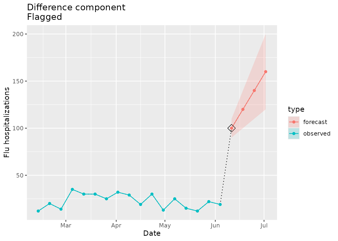
Not flagged as implausible
The next example will include data that does not “jump” in absolute difference beyond what has been observed in the time series previously:
point_est <- c(28, 31, 34, 37)

prepped_forecast <-
  tibble(
    location = "01",
    date = seq(as.Date("2022-06-11"), as.Date("2022-07-02"), by = 7),
    horizon = 1:4,
    lower = point_est - c(5, 10, 15, 20),
    point = point_est,
    upper = point_est + c(5, 10, 15, 20),
  ) %>%
  to_signal(outcome = "flu.admits", type = "forecast", horizon = 4)
prepped_forecast$data| location | date | horizon | lower | point | upper |
|---|---|---|---|---|---|
| 01 | 2022-06-11 | 1 | 23 | 28 | 33 |
| 01 | 2022-06-18 | 2 | 21 | 31 | 41 |
| 01 | 2022-06-25 | 3 | 19 | 34 | 49 |
| 01 | 2022-07-02 | 4 | 17 | 37 | 57 |
Again, we can see the last value and maximum observed difference for the given location that will be used internally in the seed:
prepped_seed$`01`$last_value
#> [1] 19

prepped_seed$`01`$diff$max
#> [1] 21
Given this max difference, we would not expect the implausibility flag to be raised in this case:
plane_diff(location = "01", input = prepped_forecast, seed = prepped_seed)
#> $indicator
#> [1] FALSE
#>
#> $values
#> [1] 19 28 31 34 37
#>
#> $evaluated_differences
#> [1] 9 3 3 3
#>
#> $maximum_difference
#> [1] 21
The plot below shows the forecasted data that would not raise the difference flag:
diff_dat <-
  prepped_forecast$data %>%
  mutate(type = "forecast") %>%
  rename(flu.admits = point) %>%
  bind_rows(observed_signal$data %>% filter(location == "01") %>% filter(date <= "2022-06-04") %>% mutate(type="observed"), . )

diff_dat %>%
  ggplot(mapping = aes(x = date, y = flu.admits)) +
  geom_line(lty = "dotted") +
  geom_line(aes(colour = type)) +
  geom_point(aes(colour = type)) +
  geom_ribbon(aes(ymin = lower, ymax = upper, fill = type), alpha = 0.2) +
  xlab("Date") +
  ylab("Flu hospitalizations") +
  ggtitle("Difference component\nNot flagged")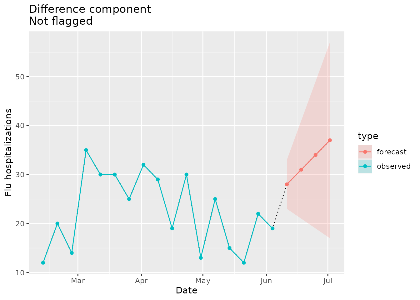
Coverage - plane_cover()
The coverage component compares the prediction interval for the first horizon of the evaluated signal to the most recent value in the seed. If the interval does not cover the most recent data point, then the flag is raised as implausible. Because this component requires a prediction interval, it can only be used to assess plausibility of forecast signals.
Flagged as implausible
We can create forecast data that includes a prediction interval that does not cover the most recent value in seed:
## make sure the 1 week-ahead point estimate and PI do not cover the last reported obs
point_est <- c(60, 62, 64, 66)

prepped_forecast <-
  tibble(
    location = "01",
    date = seq(as.Date("2022-06-11"), as.Date("2022-07-02"), by = 7),
    horizon = 1:4,
    lower = point_est - c(2, 4, 6, 8),
    point = point_est,
    upper = point_est + c(2, 4, 6, 8)
  ) %>%
  to_signal(outcome = "flu.admits", type = "forecast", horizon = 4)
prepped_forecast$data| location | date | horizon | lower | point | upper |
|---|---|---|---|---|---|
| 01 | 2022-06-11 | 1 | 58 | 60 | 62 |
| 01 | 2022-06-18 | 2 | 58 | 62 | 66 |
| 01 | 2022-06-25 | 3 | 58 | 64 | 70 |
| 01 | 2022-07-02 | 4 | 58 | 66 | 74 |
The prediction interval is quite narrow and departs from the last observed value in the seed:
prepped_seed$`01`$last_value
#> [1] 19
We would expect the coverage flag to be raised:
plane_cover(location = "01", input = prepped_forecast, seed = prepped_seed)
#> $indicator
#> [1] TRUE
#>
#> $last_value
#> [1] 19
#>
#> $bounds
#> $bounds$lower
#> [1] 58
#>
#> $bounds$upper
#> [1] 62
The plot below shows the coverage of the forecast prediction intervals in relation to the seed data:
cover_dat <-
  prepped_forecast$data %>%
  mutate(type = "forecast") %>%
  rename(flu.admits = point) %>%
  bind_rows(observed_signal$data %>% filter(location == "01") %>% filter(date <= "2022-06-04") %>% mutate(type="observed"), . )

cov_flags <-
  cover_dat %>%
  filter(type == "observed") %>%
  filter(date == max(date))

ggplot(data = cover_dat, mapping = aes(x = date, y = flu.admits)) +
  geom_line(lty="dotted") +
  geom_line(aes(colour = type)) +
  geom_point(aes(colour = type)) +
  geom_point(data = cov_flags, mapping = aes(x = date, y = flu.admits), shape=23, size=4, color = "black") +
  geom_ribbon(aes(ymin = lower, ymax = upper, fill = type), alpha = 0.2) +
  xlab("Date") +
  ylab("Flu hospitalizations") +
  ggtitle(paste("Coverage component\nFlagged"))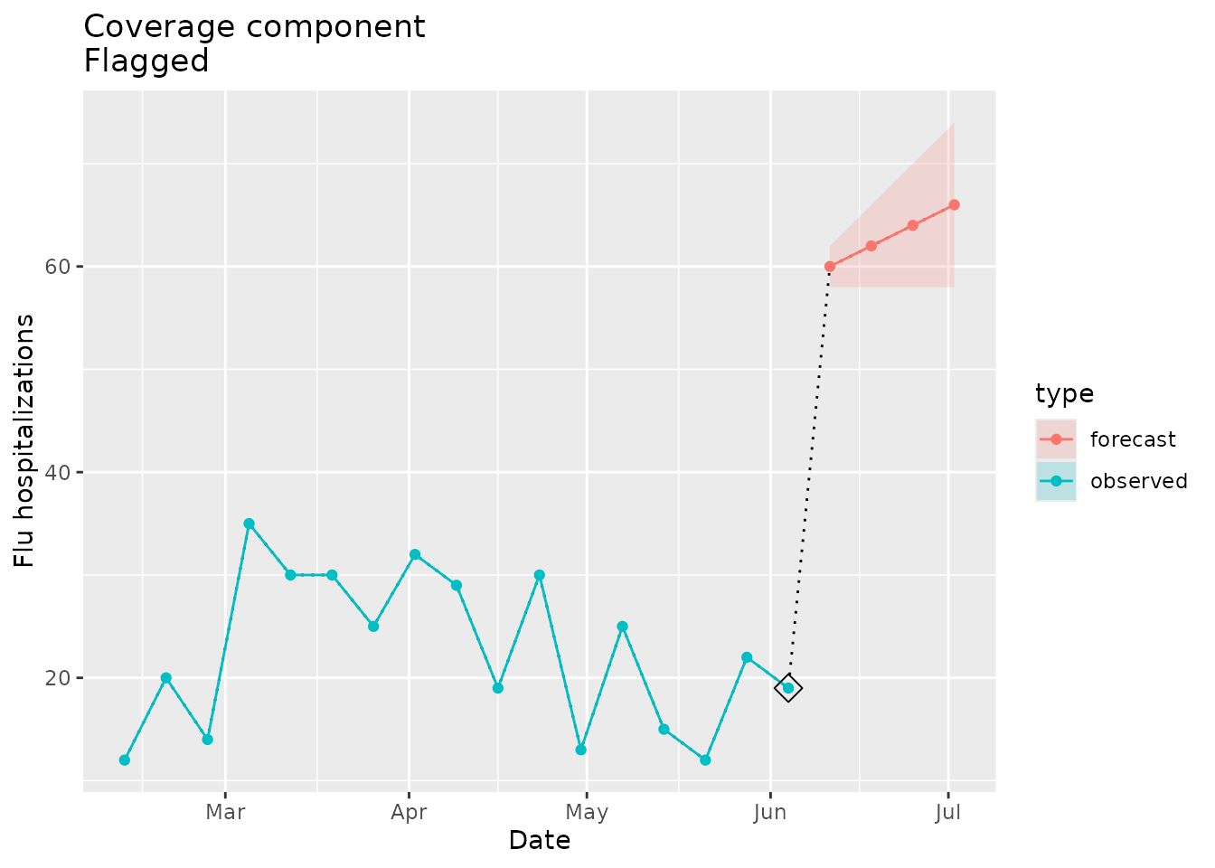
Not flagged as implausible
We can put together an example where the prediction interval for the first horizon covers the most recent value in the seed data:
## make sure the 1 week-ahead point estimate and PI cover the last reported obs
point_est <- c(28, 31, 34, 37)

prepped_forecast <-
  tibble(
    location = "01",
    date = seq(as.Date("2022-06-11"), as.Date("2022-07-02"), by = 7),
    horizon = 1:4,
    lower = point_est - 28,
    point = point_est,
    upper = point_est + 28
    ) %>%
  to_signal(outcome = "flu.admits", type = "forecast", horizon = 4)
prepped_forecast$data| location | date | horizon | lower | point | upper |
|---|---|---|---|---|---|
| 01 | 2022-06-11 | 1 | 0 | 28 | 56 |
| 01 | 2022-06-18 | 2 | 3 | 31 | 59 |
| 01 | 2022-06-25 | 3 | 6 | 34 | 62 |
| 01 | 2022-07-02 | 4 | 9 | 37 | 65 |
prepped_seed$`01`$last_value
#> [1] 19
Given the coverage, we would not expect the signal to be flagged as implausible:
plane_cover(location = "01", input = prepped_forecast, seed = prepped_seed)
#> $indicator
#> [1] FALSE
#>
#> $last_value
#> [1] 19
#>
#> $bounds
#> $bounds$lower
#> [1] 0
#>
#> $bounds$upper
#> [1] 56
Again, we can visualize the coverage of the forecast relative to the seed data:
cover_dat <-
  prepped_forecast$data %>%
  mutate(type = "forecast") %>%
  rename(flu.admits = point) %>%
  bind_rows(observed_signal$data %>% filter(location == "01") %>% filter(date <= "2022-06-04") %>% mutate(type="observed"), . )

ggplot(data = cover_dat, mapping = aes(x = date, y = flu.admits)) +
  geom_line(lty="dotted") +
  geom_line(aes(colour = type)) +
  geom_point(aes(colour = type)) +
  geom_ribbon(aes(ymin = lower, ymax = upper, fill = type), alpha = 0.2) +
  xlab("Date") +
  ylab("Flu hospitalizations") +
  ggtitle(paste("Coverage component\nNot flagged"))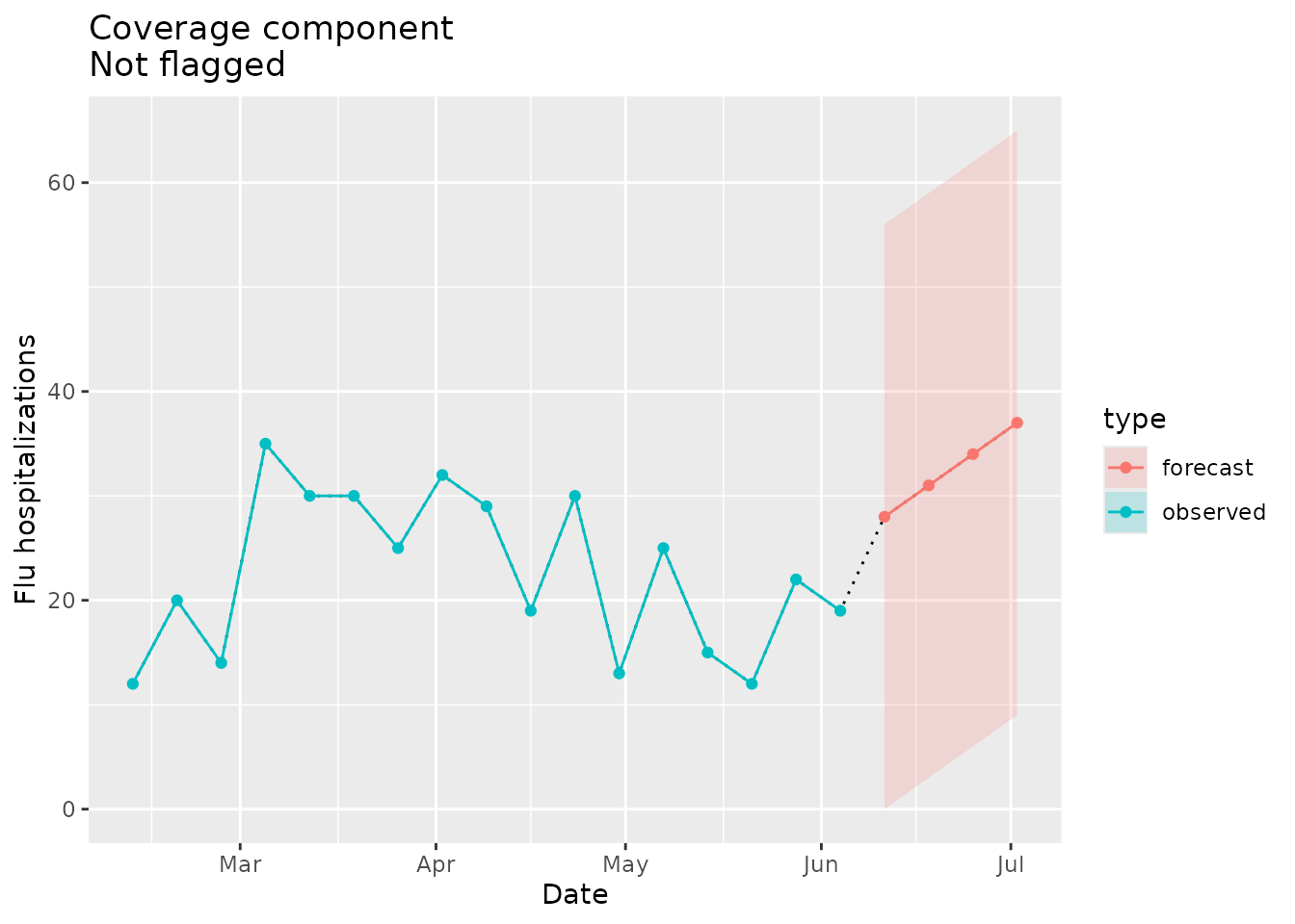
Taper - plane_taper()
The taper component checks whether or not the prediction interval for the evaluated signal decreases in width (i.e., certainty increases) as horizons progress. Because this component requires a prediction interval, it can only be used to assess plausibility of forecast signals.
Flagged as implausible
Here we create a mock forecast that will have a narrowing prediction interval:
point_est <- c(30, 33, 36, 39)

prepped_forecast <-
  tibble(
    location = "01",
    date = seq(as.Date("2022-06-11"), as.Date("2022-07-02"), by = 7),
    horizon = 1:4,
    ## make the lower and upper bounds get narrower as horizon increases
    lower = point_est - c(20, 15, 10, 5),
    point = point_est,
    upper = point_est + c(20, 15, 10, 5)
  ) %>%
  to_signal(outcome = "flu.admits", type = "forecast", horizon = 4)
prepped_forecast$data| location | date | horizon | lower | point | upper |
|---|---|---|---|---|---|
| 01 | 2022-06-11 | 1 | 10 | 30 | 50 |
| 01 | 2022-06-18 | 2 | 18 | 33 | 48 |
| 01 | 2022-06-25 | 3 | 26 | 36 | 46 |
| 01 | 2022-07-02 | 4 | 34 | 39 | 44 |
The width of the prediction interval narrows from 40 to 30 to 20 to 10 over the forecasted horizons. We would expect the taper flag to be raised:
plane_taper(location = "01", input = prepped_forecast, seed = prepped_seed)
#> $indicator
#> [1] TRUE
#>
#> $widths
#> [1] 40 30 20 10
The plot below visually demonstrates the tapering effect:
taper_dat <-
  prepped_forecast$data %>%
  mutate(type = "forecast") %>%
  rename(flu.admits = point) %>%
  bind_rows(observed_signal$data %>% filter(location == "01") %>% filter(date <= "2022-06-04") %>% mutate(type="observed"), . )

taper_flags <-
  taper_dat %>%
  filter(type == "forecast")

taper_dat %>%
  ggplot(data = taper_dat, mapping = aes(x = date, y = flu.admits)) +
  geom_line(lty="dotted") +
  geom_line(aes(colour = type)) +
  geom_point(aes(colour = type)) +
  geom_point(data = taper_flags, mapping = aes(x = date, y = flu.admits), shape=23, size=4, color = "black") +
  geom_ribbon(aes(ymin = lower, ymax = upper, fill = type), alpha = 0.2) +
  xlab("Date") +
  ylab("Flu Hospital Admissions") +
  ggtitle(paste("Taper component\nFlagged"))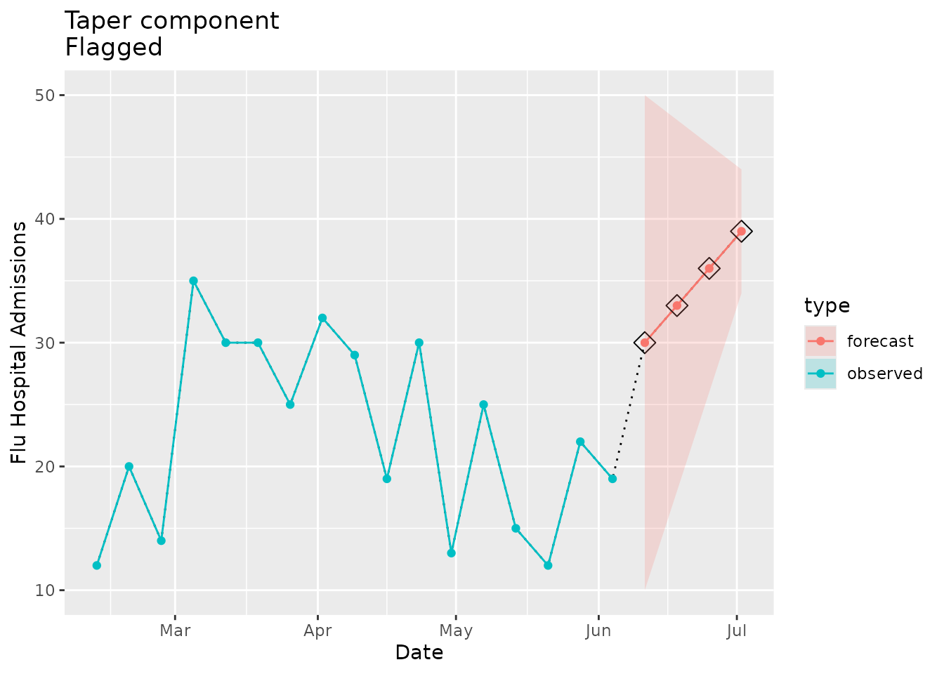
Not flagged as implausible
Now we can look at an example where the forecasted prediction interval increases in width as horizons progress:
point_est <- c(30, 33, 36, 39)

prepped_forecast <-
  tibble(
    location = "01",
    date = seq(as.Date("2022-06-11"), as.Date("2022-07-02"), by = 7),
    horizon = 1:4,
    ## make the lower and upper bounds get wider as horizon increases
    lower = point_est - c(5, 10, 15, 20),
    point = point_est,
    upper = point_est + c(5, 10, 15, 20)
  ) %>%
  to_signal(outcome = "flu.admits", type = "forecast", horizon = 4)
prepped_forecast$data| location | date | horizon | lower | point | upper |
|---|---|---|---|---|---|
| 01 | 2022-06-11 | 1 | 25 | 30 | 35 |
| 01 | 2022-06-18 | 2 | 23 | 33 | 43 |
| 01 | 2022-06-25 | 3 | 21 | 36 | 51 |
| 01 | 2022-07-02 | 4 | 19 | 39 | 59 |
We would not expect the implausibility flag to be raised in this case:
plane_taper(location = "01", input = prepped_forecast, seed = prepped_seed)
#> $indicator
#> [1] FALSE
#>
#> $widths
#> [1] 10 20 30 40
In the visualization below we see that the forecast prediction interval does not taper:
taper_dat <-
  prepped_forecast$data %>%
  mutate(type = "forecast") %>%
  rename(flu.admits = point) %>%
  bind_rows(observed_signal$data %>% filter(location == "01") %>% filter(date <= "2022-06-04") %>% mutate(type="observed"), . )

taper_dat %>%
  ggplot(data = taper_dat, mapping = aes(x = date, y = flu.admits)) +
  geom_line(lty="dotted") +
  geom_line(aes(colour = type)) +
  geom_point(aes(colour = type)) +
  geom_ribbon(aes(ymin = lower, ymax = upper, fill = type), alpha = 0.2) +
  xlab("Date") +
  ylab("Flu Hospital Admissions") +
  ggtitle(paste("Taper component\nNot flagged"))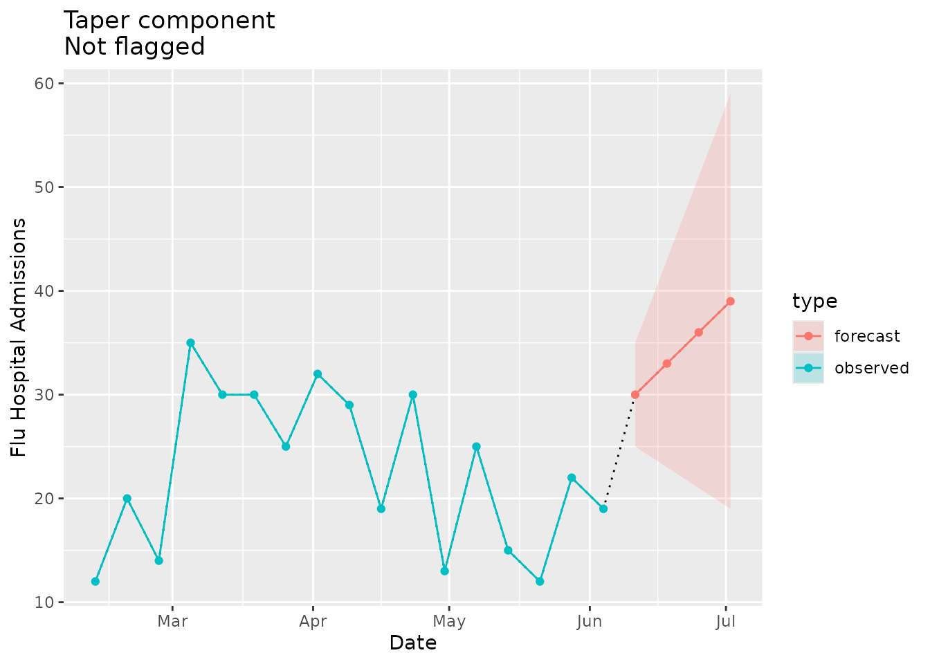
Repeat - plane_repeat()
The repeat component checks whether consecutive values in an observed or forecasted signal are repeated k times. When the seed is created, it stores the maximum number of consecutive repeats for each location and uses this as the default value for k. If the evaluated data exceeds k then the signal is considered implausible and a flag is raised.
The k threshold for repeats can be customized using the “tolerance” parameter. The function also allows users to customize the “prepend” length (i.e., the number of most recent values from seed to be concatenated with the evaluated signal while checking for repeats).
To illustrate the repeat parameters, we can contrive a simple
example. Consider seed values of 11, 12, 13, 13, 13 and an
evaluated forecast with point estimates 13, 13, 15, 16. If
the tolerance threshold is set at 4 and prepend length is
2 then the sequence 13, 13, 13, 13, 15, 16
would be checked for any set of more than four values repeated
consecutively. In that case, no flag would be raised. The value
13 is repeated four times but we tolerate at most
four repeats. However, if we keep the tolerance at 4 and
change the prepend length to 3, the evaluated sequence
would be 13, 13, 13, 13, 13, 15, 16, and a flag would be
raised, because there were more repeats than the tolerance
threshold.
For more on these parameters see ?plane_repeat().
Flagged as implausible
We can mock up some example data that repeats the same point estimate:
## make sure the point estimates repeat
point_est <- c(55, 55, 55, 55)

prepped_forecast <-
  tibble(
    location = "01",
    date = seq(as.Date("2022-06-11"), as.Date("2022-07-02"), by = 7),
    horizon = 1:4,
    lower = point_est - c(5, 10, 15, 20),
    point = point_est,
    upper = point_est + c(5, 10, 15, 20)
    ) %>%
  to_signal(outcome = "flu.admits", type = "forecast", horizon = 4)
prepped_forecast$data| location | date | horizon | lower | point | upper |
|---|---|---|---|---|---|
| 01 | 2022-06-11 | 1 | 50 | 55 | 60 |
| 01 | 2022-06-18 | 2 | 45 | 55 | 65 |
| 01 | 2022-06-25 | 3 | 40 | 55 | 70 |
| 01 | 2022-07-02 | 4 | 35 | 55 | 75 |
We can check the maximum number of repeats that have been seen in the seed data:
prepped_seed$`01`$max_repeats
#> [1] 2
Because the number of repeated point estimates we have defined above exceeds the maximum repeats we expect a flag to be raised:
plane_repeat(location = "01", input = prepped_forecast, seed = prepped_seed, tolerance = NULL, prepend = NULL)
#> $indicator
#> [1] TRUE
#>
#> $repeats
#> # A tibble: 4 × 6
#>   point location date       horizon lower upper
#>   <dbl> <chr>    <date>       <int> <dbl> <dbl>
#> 1    55 01       2022-06-11       1    50    60
#> 2    55 01       2022-06-18       2    45    65
#> 3    55 01       2022-06-25       3    40    70
#> 4    55 01       2022-07-02       4    35    75
We can visualize the repeats in the forecast data:
repeat_dat <-
  prepped_forecast$data %>%
  mutate(type = "forecast") %>%
  rename(flu.admits = point) %>%
  bind_rows(observed_signal$data %>% filter(location == "01") %>% filter(date <= "2022-06-04") %>% mutate(type="observed"), . )

repeat_flags <-
  repeat_dat %>%
  filter(type == "forecast")

repeat_dat %>%
  ggplot(data = repeat_dat, mapping = aes(x = date, y = flu.admits)) +
  geom_line(lty="dotted") +
  geom_line(aes(colour = type)) +
  geom_point(aes(colour = type)) +
  geom_point(data = repeat_flags, mapping = aes(x = date, y = flu.admits), shape=23, size=4, color = "black") +
  geom_ribbon(aes(ymin = lower, ymax = upper,fill = type), alpha = 0.2) +
  xlab("Date") +
  ylab("Flu hospitalizations") +
  ggtitle(paste("Repeat component\nFlagged"))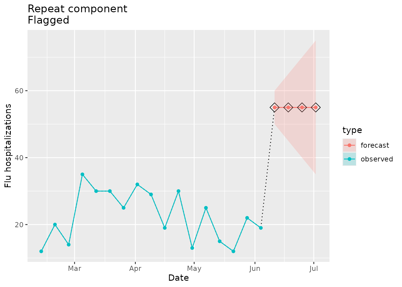
Controlling sensitivity with parameters
As described above, the “tolerance” parameter allows the user to
override the default behavior that sets the maximum number of repeats
via the seed. Setting a higher tolerance will decrease the sensitivity
of the repeat assessment. In this example, if we increase the tolerance
to 4 then we would not expect the flag to be raised:
plane_repeat(location = "01", input = prepped_forecast, seed = prepped_seed, tolerance = 4, prepend = NULL)
#> $indicator
#> [1] FALSE
#>
#> $repeats
#> # A tibble: 0 × 6
#> # ℹ 6 variables: point <dbl>, location <chr>, date <date>, horizon <int>,
#> #   lower <dbl>, upper <dbl>
Not flagged as implausible
Here we prepare mock forecast data that does not have repeating point estimates:
## make sure the point estimates do not repeat
point_est <- c(55, 57, 59, 61)

prepped_forecast <-
  tibble(
    location = "01",
    date = seq(as.Date("2022-06-11"), as.Date("2022-07-02"), by = 7),
    horizon = 1:4,
    lower = point_est - c(5, 10, 15, 20),
    point = point_est,
    upper = point_est + c(5, 10, 15, 20)
    ) %>%
    to_signal(outcome = "flu.admits", type = "forecast", horizon = 4)
prepped_forecast$data| location | date | horizon | lower | point | upper |
|---|---|---|---|---|---|
| 01 | 2022-06-11 | 1 | 50 | 55 | 60 |
| 01 | 2022-06-18 | 2 | 47 | 57 | 67 |
| 01 | 2022-06-25 | 3 | 44 | 59 | 74 |
| 01 | 2022-07-02 | 4 | 41 | 61 | 81 |
We can see the maximum number of repeats in the seed:
prepped_seed$`01`$max_repeats
#> [1] 2
Based on this threshold, we would not expect the implausibility flag for repeats to be raised:
plane_repeat(location = "01", input = prepped_forecast, seed = prepped_seed, tolerance = NULL, prepend = NULL)
#> $indicator
#> [1] FALSE
#>
#> $repeats
#> # A tibble: 0 × 6
#> # ℹ 6 variables: point <dbl>, location <chr>, date <date>, horizon <int>,
#> #   lower <dbl>, upper <dbl>
Lastly, we can visualize the repeats for the signal:
repeat_dat <-
  prepped_forecast$data %>%
  mutate(type = "forecast") %>%
  rename(flu.admits = point) %>%
  bind_rows(observed_signal$data %>% filter(location == "01") %>% filter(date <= "2022-06-04") %>% mutate(type="observed"), . )

repeat_dat %>%
  ggplot(data = repeat_dat, mapping = aes(x = date, y = flu.admits)) +
  geom_line(lty="dotted") +
  geom_line(aes(colour = type)) +
  geom_point(aes(colour = type)) +
  geom_ribbon(aes(ymin = lower, ymax = upper, fill = type), alpha = 0.2) +
  xlab("Date") +
  ylab("Flu hospitalizations") +
  ggtitle(paste("Repeat component\nNot flagged"))
Trend - plane_trend()
The trend component assesses whether or not there is a significant change in the magnitude or direction of the slope for the evaluated signal compared to the most recent data in the seed. If a “change point” is identified in any of the forecasted horizons and/or the most recent seed value, then the flag is raised for implausibility. The trend component requires at least four times as many seed values as there are evaluated values. Furthermore, the component currently can only be used with forecasted signals.
One of the parameters for the trend function is “sig_lvl”, which
defines the significance level for the internal permutation test used to
detect change points. By default this value is set to 0.1.
The significance level determines the sensitivity of the trend
plausibility assessment, with a lower value corresponding to a less
sensitive evaluation.
For more on the trend algorithm methods see
?plane_trend().
Flagged as implausible
Here we create some example data that doubles with each forecasted horizon:
point_est <- c(25, 50, 100, 200)

prepped_forecast <-
  tibble(
    location = "01",
    date = seq(as.Date("2022-06-11"), as.Date("2022-07-02"), by = 7),
    horizon = 1:4,
    lower = point_est - c(5, 10, 20, 40),
    point = point_est,
    upper = point_est + c(5, 10, 20, 40),
  ) %>%
  to_signal(outcome = "flu.admits", type = "forecast", horizon = 4)
prepped_forecast$data| location | date | horizon | lower | point | upper |
|---|---|---|---|---|---|
| 01 | 2022-06-11 | 1 | 20 | 25 | 30 |
| 01 | 2022-06-18 | 2 | 40 | 50 | 60 |
| 01 | 2022-06-25 | 3 | 80 | 100 | 120 |
| 01 | 2022-07-02 | 4 | 160 | 200 | 240 |
We expect the dramatic increase in slope will be detected as a change point and a flag raised:
plane_trend(location = "01", input = prepped_forecast, seed = prepped_seed, sig_lvl = 0.1)
#> $indicator
#> [1] TRUE
#>
#> $output
#> # A tibble: 20 × 7
#>    Location Index Date       Value Type     Changepoint Flagged
#>    <chr>    <int> <date>     <dbl> <chr>    <lgl>       <lgl>
#>  1 01           1 2022-02-19    20 Observed FALSE       FALSE
#>  2 01           2 2022-02-26    14 Observed FALSE       FALSE
#>  3 01           3 2022-03-05    35 Observed FALSE       FALSE
#>  4 01           4 2022-03-12    30 Observed FALSE       FALSE
#>  5 01           5 2022-03-19    30 Observed FALSE       FALSE
#>  6 01           6 2022-03-26    25 Observed FALSE       FALSE
#>  7 01           7 2022-04-02    32 Observed FALSE       FALSE
#>  8 01           8 2022-04-09    29 Observed FALSE       FALSE
#>  9 01           9 2022-04-16    19 Observed FALSE       FALSE
#> 10 01          10 2022-04-23    30 Observed FALSE       FALSE
#> 11 01          11 2022-04-30    13 Observed FALSE       FALSE
#> 12 01          12 2022-05-07    25 Observed FALSE       FALSE
#> 13 01          13 2022-05-14    15 Observed FALSE       FALSE
#> 14 01          14 2022-05-21    12 Observed FALSE       FALSE
#> 15 01          15 2022-05-28    22 Observed FALSE       FALSE
#> 16 01          16 2022-06-04    19 Observed FALSE       FALSE
#> 17 01          17 2022-06-11    25 Forecast FALSE       FALSE
#> 18 01          18 2022-06-18    50 Forecast TRUE        TRUE
#> 19 01          19 2022-06-25   100 Forecast FALSE       FALSE
#> 20 01          20 2022-07-02   200 Forecast FALSE       FALSE
#>
#> $flagged_dates
#> [1] "2022-06-18"
The plot below shows the forecasted value identified as a change point:
trend_dat <-
  prepped_forecast$data %>%
  mutate(type = "forecast") %>%
  rename(flu.admits = point) %>%
  bind_rows(observed_signal$data %>% filter(location == "01") %>% filter(date <= "2022-06-04") %>% mutate(type="observed"), . )

trend_flags <-
  plane_trend(location = "01", input = prepped_forecast, seed = prepped_seed, sig_lvl = 0.1)$output %>%
  filter(Changepoint == TRUE)


ggplot(data = trend_dat, mapping = aes(x = date, y = flu.admits)) +
  geom_line(lty="dotted") +
  geom_line(aes(colour = type)) +
  geom_point(aes(colour = type)) +
  geom_ribbon(aes(ymin = lower, ymax = upper, fill = type), alpha = 0.2) +
  geom_point(data = trend_flags, mapping = aes(x = Date, y = Value), shape=23, size=4) +
  xlab("Date") +
  ylab("Flu hospitalizations") +
  ggtitle(paste("Trend component\nFlagged"))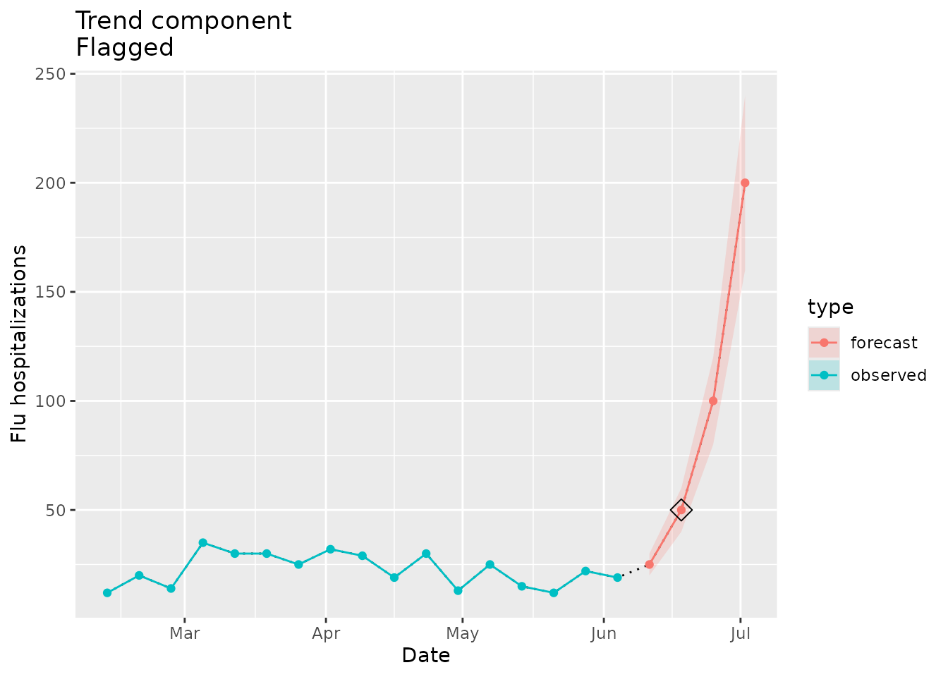
Controlling sensitivity with parameters
By toggling the significance level, we can control the sensitivity of
the trend assessment. Here we lower the significance level to
0.001 and see that the flag is no longer raised using the
same data as above:
plane_trend(location = "01", input = prepped_forecast, seed = prepped_seed, sig_lvl = 0.001)
#> $indicator
#> [1] FALSE
#>
#> $output
#> # A tibble: 20 × 7
#>    Location Index Date       Value Type     Changepoint Flagged
#>    <chr>    <int> <date>     <dbl> <chr>    <lgl>       <lgl>
#>  1 01           1 2022-02-19    20 Observed FALSE       FALSE
#>  2 01           2 2022-02-26    14 Observed FALSE       FALSE
#>  3 01           3 2022-03-05    35 Observed FALSE       FALSE
#>  4 01           4 2022-03-12    30 Observed FALSE       FALSE
#>  5 01           5 2022-03-19    30 Observed FALSE       FALSE
#>  6 01           6 2022-03-26    25 Observed FALSE       FALSE
#>  7 01           7 2022-04-02    32 Observed FALSE       FALSE
#>  8 01           8 2022-04-09    29 Observed FALSE       FALSE
#>  9 01           9 2022-04-16    19 Observed FALSE       FALSE
#> 10 01          10 2022-04-23    30 Observed FALSE       FALSE
#> 11 01          11 2022-04-30    13 Observed FALSE       FALSE
#> 12 01          12 2022-05-07    25 Observed FALSE       FALSE
#> 13 01          13 2022-05-14    15 Observed FALSE       FALSE
#> 14 01          14 2022-05-21    12 Observed FALSE       FALSE
#> 15 01          15 2022-05-28    22 Observed FALSE       FALSE
#> 16 01          16 2022-06-04    19 Observed FALSE       FALSE
#> 17 01          17 2022-06-11    25 Forecast FALSE       FALSE
#> 18 01          18 2022-06-18    50 Forecast FALSE       FALSE
#> 19 01          19 2022-06-25   100 Forecast FALSE       FALSE
#> 20 01          20 2022-07-02   200 Forecast FALSE       FALSE
#>
#> $flagged_dates
#> [1] NA
Not flagged as implausible
We can also make example data that reflects a consistent trend with the seed:
point_est <- c(40, 41, 40, 43)

prepped_forecast <-
  tibble(
    location = "01",
    date = seq(as.Date("2022-06-11"), as.Date("2022-07-02"), by = 7),
    horizon = 1:4,
    lower = point_est - c(5, 10, 15, 20),
    point = point_est,
    upper = point_est + c(5, 10, 15, 20),
  ) %>%
  to_signal(outcome = "flu.admits", type = "forecast", horizon = 4)
prepped_forecast$data| location | date | horizon | lower | point | upper |
|---|---|---|---|---|---|
| 01 | 2022-06-11 | 1 | 35 | 40 | 45 |
| 01 | 2022-06-18 | 2 | 31 | 41 | 51 |
| 01 | 2022-06-25 | 3 | 25 | 40 | 55 |
| 01 | 2022-07-02 | 4 | 23 | 43 | 63 |
In this case we would not expect an implausibility flag to be raised:
plane_trend(location = "01", input = prepped_forecast, seed = prepped_seed, sig_lvl = 0.1)
#> $indicator
#> [1] FALSE
#>
#> $output
#> # A tibble: 20 × 7
#>    Location Index Date       Value Type     Changepoint Flagged
#>    <chr>    <int> <date>     <dbl> <chr>    <lgl>       <lgl>
#>  1 01           1 2022-02-19    20 Observed FALSE       FALSE
#>  2 01           2 2022-02-26    14 Observed FALSE       FALSE
#>  3 01           3 2022-03-05    35 Observed FALSE       FALSE
#>  4 01           4 2022-03-12    30 Observed FALSE       FALSE
#>  5 01           5 2022-03-19    30 Observed FALSE       FALSE
#>  6 01           6 2022-03-26    25 Observed FALSE       FALSE
#>  7 01           7 2022-04-02    32 Observed FALSE       FALSE
#>  8 01           8 2022-04-09    29 Observed FALSE       FALSE
#>  9 01           9 2022-04-16    19 Observed FALSE       FALSE
#> 10 01          10 2022-04-23    30 Observed FALSE       FALSE
#> 11 01          11 2022-04-30    13 Observed FALSE       FALSE
#> 12 01          12 2022-05-07    25 Observed FALSE       FALSE
#> 13 01          13 2022-05-14    15 Observed FALSE       FALSE
#> 14 01          14 2022-05-21    12 Observed FALSE       FALSE
#> 15 01          15 2022-05-28    22 Observed FALSE       FALSE
#> 16 01          16 2022-06-04    19 Observed FALSE       FALSE
#> 17 01          17 2022-06-11    40 Forecast FALSE       FALSE
#> 18 01          18 2022-06-18    41 Forecast FALSE       FALSE
#> 19 01          19 2022-06-25    40 Forecast FALSE       FALSE
#> 20 01          20 2022-07-02    43 Forecast FALSE       FALSE
#>
#> $flagged_dates
#> [1] NA
The visualization below shows the consistency of the forecasted trend with the comparison data in the seed:
trend_dat <-
  prepped_forecast$data %>%
  mutate(type = "forecast") %>%
  rename(flu.admits = point) %>%
  bind_rows(observed_signal$data %>% filter(location == "01") %>% filter(date <= "2022-06-04") %>% mutate(type="observed"), . )

trend_flags <-
  plane_trend(location = "01", input = prepped_forecast, seed = prepped_seed, sig_lvl = 0.1)$output %>%
  filter(Changepoint == TRUE)

ggplot(data = trend_dat, mapping = aes(x = date, y = flu.admits)) +
  geom_line(lty="dotted") +
  geom_line(aes(colour = type)) +
  geom_point(aes(colour = type)) +
  geom_ribbon(aes(ymin = lower, ymax = upper, fill = type), alpha = 0.2) +
  geom_point(data = trend_flags, mapping = aes(x = Date, y = Value), shape=23, size=4) +
  xlab("Date") +
  ylab("Flu hospitalizations") +
  ggtitle(paste("Trend component\nNot flagged"))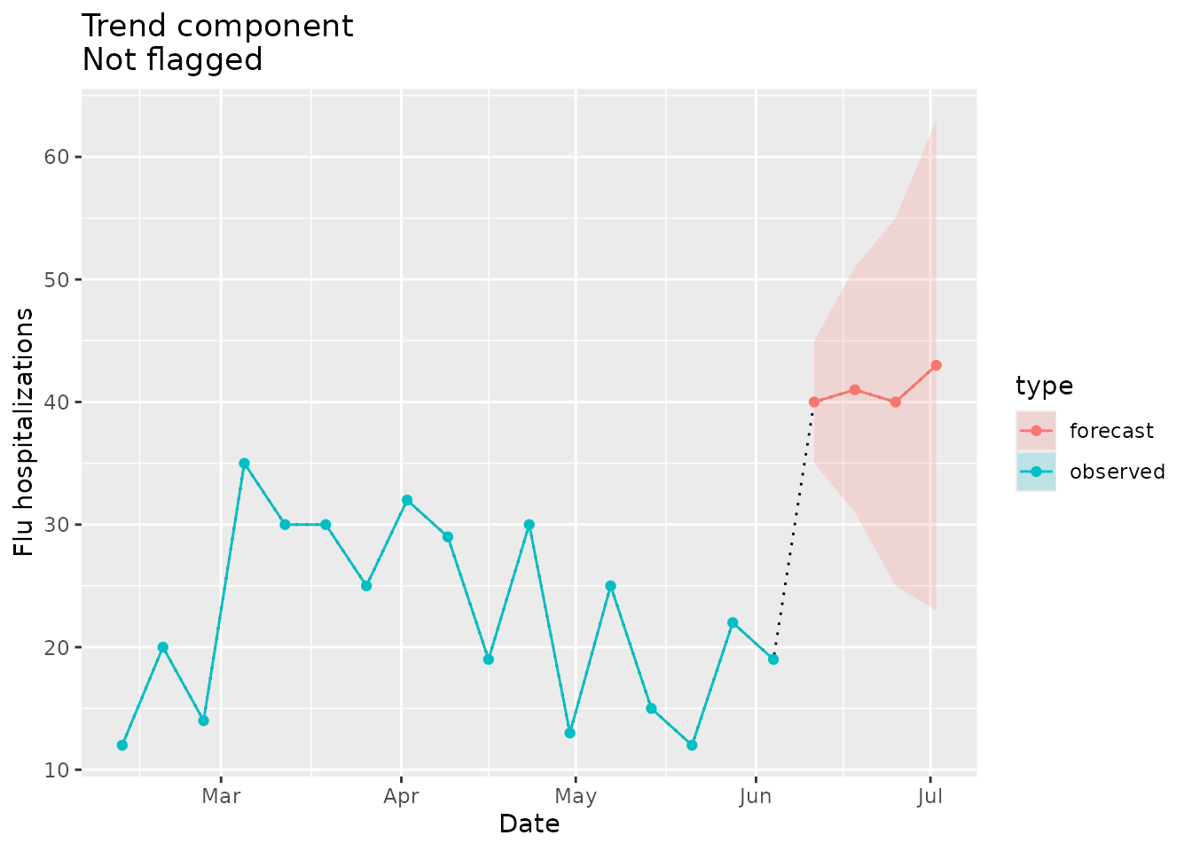
Note that there are some cases where plane_trend() will
identify a change point in the seed data but will not raise an
implausibility flag for the forecast. The trend component checks for
change points in all forecasted horizons and the most recent value in
the seed. If there is a significant change point found elsewhere in the
seed time series, the function will not raise a flag. However, the
output includes any change points detected regardless of whether or not
they raised on an implausibility flag.
To demonstrate this, we can look at location “06”. For this example,
we need to define a new prepped_seed object because this
change point occurs after our previously defined cut date:
## create seed with cut date
prepped_seed2 <- plane_seed(observed_signal, cut_date = "2022-10-29")
point_est <- c(40, 41, 40, 43)

prepped_forecast <-
  tibble(
    location = "06",
    date = seq(as.Date("2022-11-05"), as.Date("2022-11-26"), by = 7),
    horizon = 1:4,
    lower = point_est - c(5, 10, 15, 20),
    point = point_est,
    upper = point_est + c(5, 10, 15, 20),
  ) %>%
  to_signal(outcome = "flu.admits", type = "forecast", horizon = 4)
prepped_forecast$data| location | date | horizon | lower | point | upper |
|---|---|---|---|---|---|
| 06 | 2022-11-05 | 1 | 35 | 40 | 45 |
| 06 | 2022-11-12 | 2 | 31 | 41 | 51 |
| 06 | 2022-11-19 | 3 | 25 | 40 | 55 |
| 06 | 2022-11-26 | 4 | 23 | 43 | 63 |
In this case we would not expect an implausibility flag to be raised, but we do see a change point:
plane_trend(location = "06", input = prepped_forecast, seed = prepped_seed2, sig_lvl = 0.1)
#> $indicator
#> [1] FALSE
#>
#> $output
#> # A tibble: 20 × 7
#>    Location Index Date       Value Type     Changepoint Flagged
#>    <chr>    <int> <date>     <dbl> <chr>    <lgl>       <lgl>
#>  1 06           1 2022-07-16   102 Observed FALSE       FALSE
#>  2 06           2 2022-07-23    64 Observed FALSE       FALSE
#>  3 06           3 2022-07-30    46 Observed FALSE       FALSE
#>  4 06           4 2022-08-06    39 Observed FALSE       FALSE
#>  5 06           5 2022-08-13    38 Observed FALSE       FALSE
#>  6 06           6 2022-08-20    39 Observed FALSE       FALSE
#>  7 06           7 2022-08-27    33 Observed FALSE       FALSE
#>  8 06           8 2022-09-03    35 Observed FALSE       FALSE
#>  9 06           9 2022-09-10    29 Observed FALSE       FALSE
#> 10 06          10 2022-09-17    24 Observed TRUE        FALSE
#> 11 06          11 2022-09-24    35 Observed FALSE       FALSE
#> 12 06          12 2022-10-01    72 Observed FALSE       FALSE
#> 13 06          13 2022-10-08    93 Observed FALSE       FALSE
#> 14 06          14 2022-10-15    97 Observed FALSE       FALSE
#> 15 06          15 2022-10-22   124 Observed FALSE       FALSE
#> 16 06          16 2022-10-29   211 Observed FALSE       FALSE
#> 17 06          17 2022-11-05    40 Forecast FALSE       FALSE
#> 18 06          18 2022-11-12    41 Forecast FALSE       FALSE
#> 19 06          19 2022-11-19    40 Forecast FALSE       FALSE
#> 20 06          20 2022-11-26    43 Forecast FALSE       FALSE
#>
#> $flagged_dates
#> [1] NA
Note that on 2022-09-17, a change point was detected, but because it was not in our forecast, nor was it the last observed data point there was no flag raised.
The visualization below shows the change point in the observed data:
trend_dat <-
  prepped_forecast$data %>%
  mutate(type = "forecast") %>%
  rename(flu.admits = point) %>%
  bind_rows(observed_signal$data %>% filter(location == "06") %>% filter(date <= "2022-10-29") %>% mutate(type="observed"), . )

trend_flags <-
  plane_trend(location = "06", input = prepped_forecast, seed = prepped_seed2, sig_lvl = 0.1)$output %>%
  filter(Changepoint == TRUE)

ggplot(data = trend_dat, mapping = aes(x = date, y = flu.admits)) +
  geom_line(lty="dotted") +
  geom_line(aes(colour = type)) +
  geom_point(aes(colour = type)) +
  geom_ribbon(aes(ymin = lower, ymax = upper, fill = type), alpha = 0.2) +
  geom_point(data = trend_flags, mapping = aes(x = Date, y = Value), shape=23, size=4) +
  xlab("Date") +
  ylab("Flu hospitalizations") +
  ggtitle(paste("Trend component\nNot flagged but change point in seed"))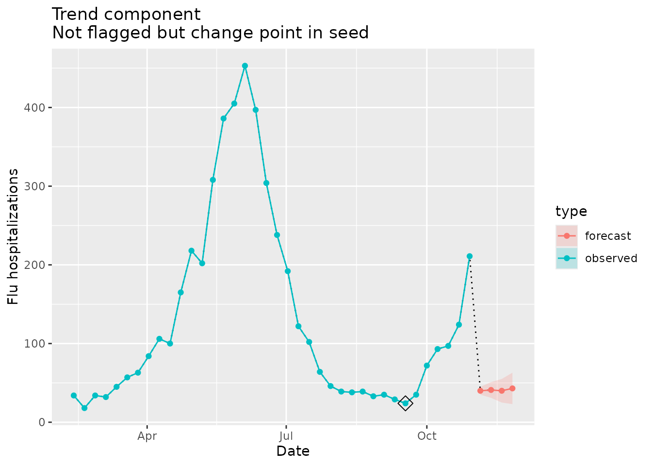
Shape - plane_shape()
The shape component evaluates the shape of the trajectory of the forecast signal and compares that shape to existing shapes in the observed seed data. If the shape is identified as novel, a flag is raised, and the signal is considered implausible.
This component has one additional argument that defines the method used to identify shapes - one of “sdiff” (scaled difference; set as default) or “dtw” (Dynamic Time Warping). Based on preliminary analyses, the “dtw” method has a higher sensitivity and a slightly lower specificity than the “sdiff” method but is much more computationally expensive.
For more information on the shape algorithm, see
?plane_shape().
Flagged as implausible
In the example below, we set the point estimates and prediction intervals of the forecast signal to a shape that is novel compared to the seed data (see plot below).
point_est <- c(60, 60, 60, 10)

prepped_forecast <-
  tibble(
    location = "01",
    date = seq(as.Date("2022-06-11"), as.Date("2022-07-02"), by = 7),
    horizon = 1:4,
    lower = point_est - 10,
    ## make an unusual shape in hospitalizations to trigger shape component
    point = point_est,
    upper = point_est + 10,
  ) %>%
  to_signal(outcome = "flu.admits", type = "forecast", horizon = 4)
prepped_forecast$data| location | date | horizon | lower | point | upper |
|---|---|---|---|---|---|
| 01 | 2022-06-11 | 1 | 50 | 60 | 70 |
| 01 | 2022-06-18 | 2 | 50 | 60 | 70 |
| 01 | 2022-06-25 | 3 | 50 | 60 | 70 |
| 01 | 2022-07-02 | 4 | 0 | 10 | 20 |
We would expect an implausibility flag to be raised for this example:
plane_shape(location = "01", input = prepped_forecast, seed = prepped_seed)
#> $indicator
#> [1] TRUE
The indicator is TRUE, meaning that the forecast is
implausible, because the shape is novel relative to the seed data.
We can visualize the shape differences and see why this shape is flagged. The forecast in the plot below (red line) clearly looks different than any shape in the observed seed data (blue line):
shape_dat <-
  prepped_forecast$data %>%
  mutate(type = "forecast") %>%
  rename(flu.admits = point) %>%
  bind_rows(observed_signal$data %>% filter(location == "01") %>% filter(date <= "2022-06-04") %>% mutate(type="observed"), . )

shape_flags <-
  shape_dat %>%
  filter(type == "forecast")

shape_dat %>%
  ggplot(mapping = aes(x = date, y = flu.admits)) +
  geom_line(lty = "dotted") +
  geom_line(aes(colour = type)) +
  geom_point(aes(colour = type)) +
  geom_ribbon(aes(ymin = lower, ymax = upper, fill = type), alpha = 0.2) +
  geom_point(data = shape_flags, mapping = aes(x = date, y = flu.admits), shape=23, size=4, color = "black") +
  xlab("Date") +
  ylab("Flu hospitalizations") +
  ggtitle("Shape component\nFlagged")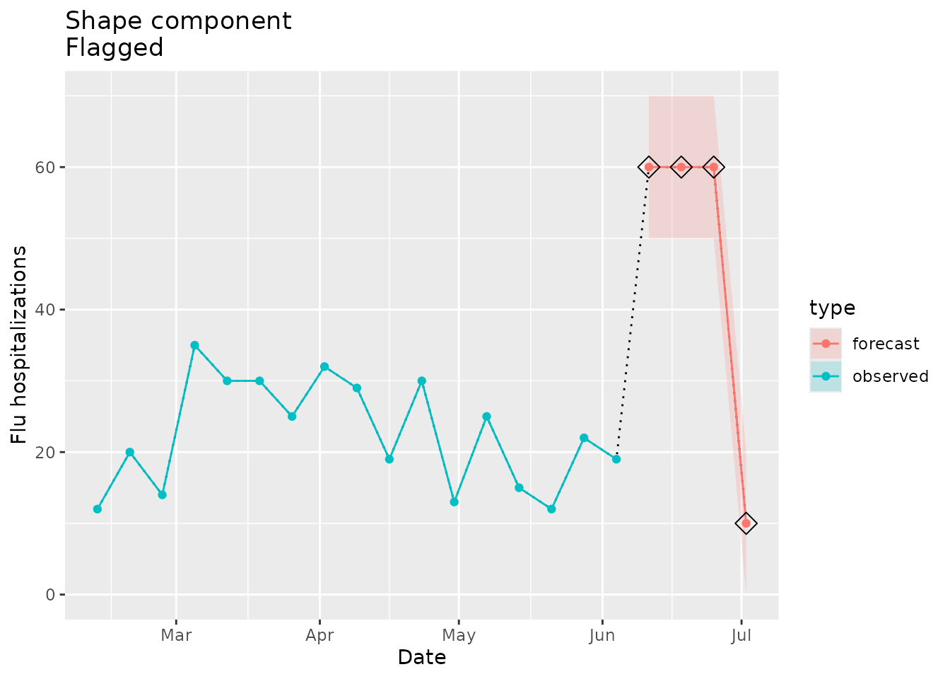
Not flagged as implausible
Next we’ll look at an example of a forecast with a familiar shape that shouldn’t trigger a flag:
point_est <- c(28, 18, 30, 20)

prepped_forecast <-
  tibble(
    location = "01",
    date = seq(as.Date("2022-06-11"), as.Date("2022-07-02"), by = 7),
    horizon = 1:4,
    lower = point_est - 10,
    ## make a familiar shape in hospitalizations to not trigger shape component
    point = point_est,
    upper = point_est + 10,
  ) %>%
  to_signal(outcome = "flu.admits", type = "forecast", horizon = 4)
prepped_forecast$data| location | date | horizon | lower | point | upper |
|---|---|---|---|---|---|
| 01 | 2022-06-11 | 1 | 18 | 28 | 38 |
| 01 | 2022-06-18 | 2 | 8 | 18 | 28 |
| 01 | 2022-06-25 | 3 | 20 | 30 | 40 |
| 01 | 2022-07-02 | 4 | 10 | 20 | 30 |
We would not expect an implausibility flag to be raised for this example:
plane_shape(location = "01", input = prepped_forecast, seed = prepped_seed)
#> $indicator
#> [1] FALSE
The indicator is FALSE, meaning that the forecast is
considered plausible, because the shape is familiar relative to the seed
data.
We can visualize the shape similarities/differences and see why this shape is not flagged. The forecast in the plot below (red line) looks very similar to the shape that we see in the observed seed data (blue line) between mid April and mid June:
shape_dat <-
  prepped_forecast$data %>%
  mutate(type = "forecast") %>%
  rename(flu.admits = point) %>%
  bind_rows(observed_signal$data %>% filter(location == "01") %>% filter(date <= "2022-06-04") %>% mutate(type="observed"), . )


shape_dat %>%
  ggplot(mapping = aes(x = date, y = flu.admits)) +
  geom_line(lty = "dotted") +
  geom_line(aes(colour = type)) +
  geom_point(aes(colour = type)) +
  geom_ribbon(aes(ymin = lower, ymax = upper, fill = type), alpha = 0.2) +
  xlab("Date") +
  ylab("Flu hospitalizations") +
  ggtitle("Shape component\nNot Flagged")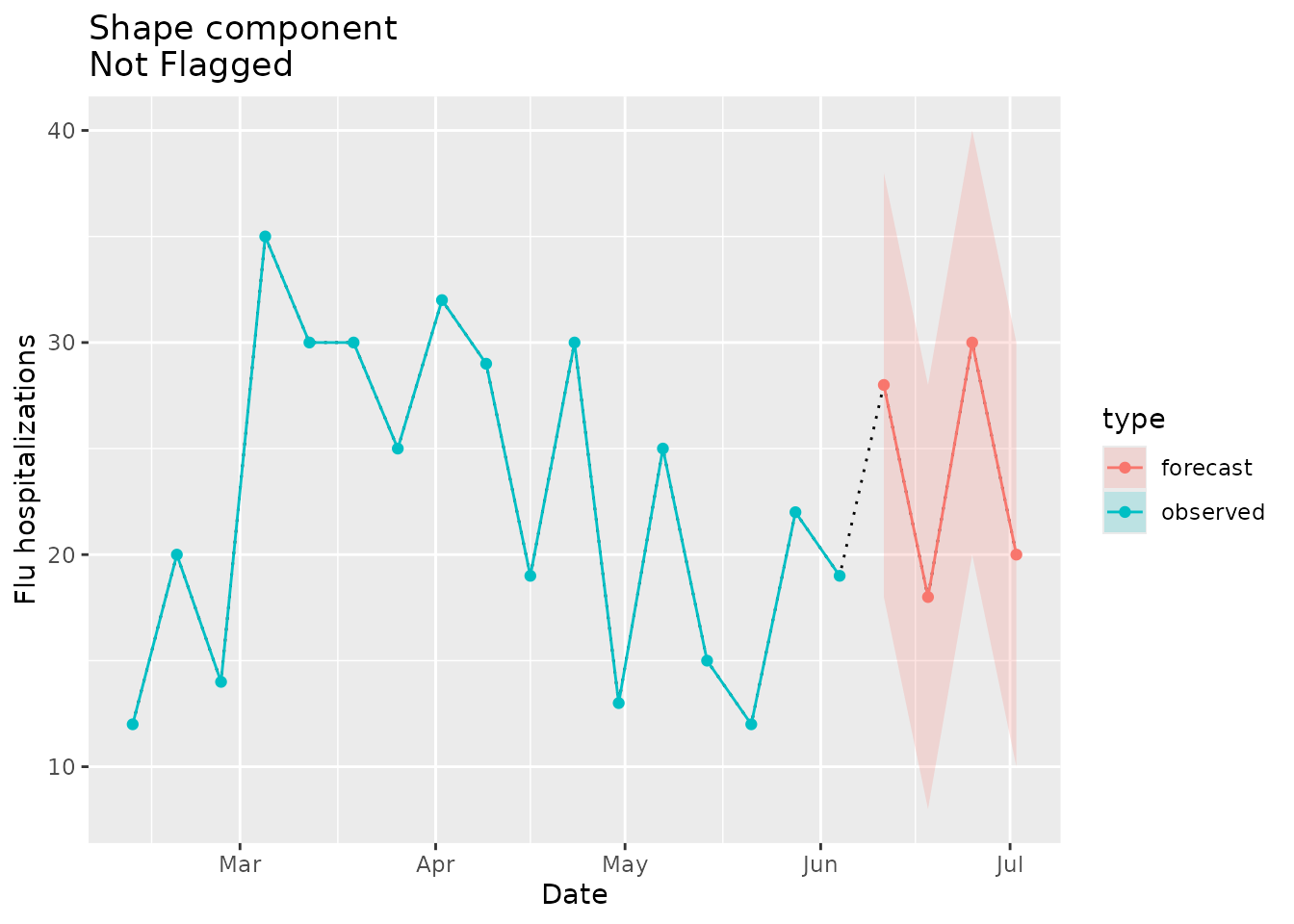
Zero - plane_zero()
This function checks for the presence of any value(s) equal to zero
in the evaluated signal. If there are any zeros found, then the function
will look in the seed to see if there are zeros anywhere else in the
time series. If so, the function will consider the evaluated zero
plausible and no flags will be raised (i.e., indicator returned as
FALSE). If not, the function will consider the evaluated
zero implausible and a flag will be raised (i.e., indicator returned as
TRUE). This function can be used on either forecast or
observed signals.
Flagged as implausible
In the example below, we add a zero to the signal point estimate to a location for which the seed has no zeros:
point_est <- c(31, 30, 31, 0)

prepped_forecast <-
  tibble(
    location = "01",
    date = seq(as.Date("2022-06-11"), as.Date("2022-07-02"), by = 7),
    horizon = 1:4,
    lower = c(26,24,24,0),
    ## add zeros in hospitalizations to trigger zero component
    point = point_est,
    upper = c(36,36,38,15)
  ) %>%
  to_signal(outcome = "flu.admits", type = "forecast", horizon = 4)
prepped_forecast$data| location | date | horizon | lower | point | upper |
|---|---|---|---|---|---|
| 01 | 2022-06-11 | 1 | 26 | 31 | 36 |
| 01 | 2022-06-18 | 2 | 24 | 30 | 36 |
| 01 | 2022-06-25 | 3 | 24 | 31 | 38 |
| 01 | 2022-07-02 | 4 | 0 | 0 | 15 |
The seed stores a logical indicating whether any zeros are present in the seed data, and there are none in this example:
prepped_seed$`01`$any_zeros
#> [1] FALSE
We would then expect an implausibility flag to be raised for this location:
plane_zero(location = "01", input = prepped_forecast, seed = prepped_seed)
#> $indicator
#> [1] TRUE
The indicator is TRUE, meaning that the forecast signal
is implausible because there are zeros in the forecast signal but not in
the observed seed.
We can visualize this below. The signal in red (a forecast in this example) has a zero in early July, but there were no zeros found in the seed data in blue.
zero_dat <-
  prepped_forecast$data %>%
  mutate(type = "forecast") %>%
  rename(flu.admits = point) %>%
  bind_rows(observed_signal$data %>% filter(location == "01") %>% filter(date <= "2022-06-04") %>% mutate(type="observed"), . )

zero_flags <- zero_dat %>%
  filter(flu.admits == 0)

zero_dat %>%
  ggplot(mapping = aes(x = date, y = flu.admits)) +
  geom_line(lty = "dotted") +
  geom_line(aes(colour = type)) +
  geom_point(data = zero_flags, mapping = aes(x = date, y = flu.admits), shape=23, size=4, color = "black") +
  geom_point(aes(colour = type)) +
  geom_ribbon(aes(ymin = lower, ymax = upper, fill = type), alpha = 0.2) +
  xlab("Date") +
  ylab("Flu hospitalizations") +
  ggtitle("Zero component\nFlagged")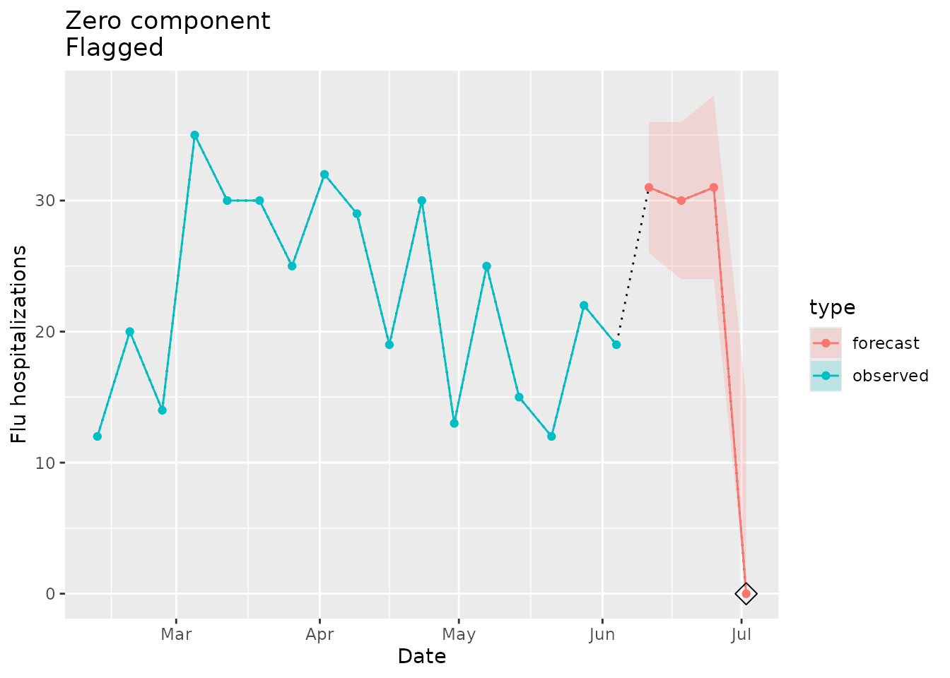
Not flagged as implausible
This function will only trigger an implausibility flag if there is a zero in the signal (either observed or forecast) and there is not one in the seed. In other words, no flag will be raised when: (1) there are no zeros in the signal or (2) there are any zeros in the seed.
Let’s look at an example where there are zeros in the signal (location “02”) and in the seed. No flag should be triggered:
point_est <- c(0, 6, 2, 3)

prepped_forecast <-
  tibble(
    location = "02",
    date = seq(as.Date("2022-06-11"), as.Date("2022-07-02"), by = 7),
    horizon = 1:4,
    lower = c(0,5,0,1),
    ## add zeros in hospitalizations
    point = point_est,
    upper = c(1,7,4,5),
  ) %>%
  to_signal(outcome = "flu.admits", type = "forecast", horizon = 4)
prepped_forecast$data| location | date | horizon | lower | point | upper |
|---|---|---|---|---|---|
| 02 | 2022-06-11 | 1 | 0 | 0 | 1 |
| 02 | 2022-06-18 | 2 | 5 | 6 | 7 |
| 02 | 2022-06-25 | 3 | 0 | 2 | 4 |
| 02 | 2022-07-02 | 4 | 1 | 3 | 5 |
The seed stores a logical indicating whether any zeros are present in the seed data, and there are zeros in this example:
prepped_seed$`02`$any_zeros
#> [1] TRUE
We then would not expect an implausibility flag to be raised for this location:
plane_zero(location = "02", input = prepped_forecast, seed = prepped_seed)
#> $indicator
#> [1] FALSE
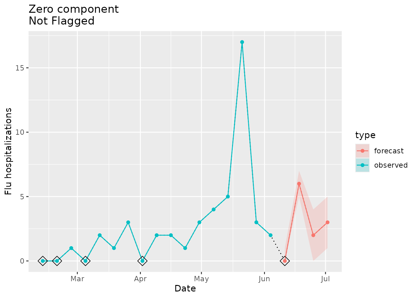
The indicator is FALSE, meaning that the forecast signal
is plausible, because there are zeros in the forecast signal and in the
observed seed.
We can visualize this below. The signal in red (a forecast in this example) has a zero around early-mid June, but there were also zeros found in the seed data in blue.
zero_dat <-
  prepped_forecast$data %>%
  mutate(type = "forecast") %>%
  rename(flu.admits = point) %>%
  bind_rows(observed_signal$data %>% filter(location == "02") %>% filter(date <= "2022-06-04") %>% mutate(type="observed"), . )

zero_flags <- zero_dat %>%
  filter(flu.admits == 0)

zero_dat %>%
  ggplot(mapping = aes(x = date, y = flu.admits)) +
  geom_line(lty = "dotted") +
  geom_line(aes(colour = type)) +
  geom_point(data = zero_flags, mapping = aes(x = date, y = flu.admits), shape=23, size=4, color = "black") +
  geom_point(aes(colour = type)) +
  geom_ribbon(aes(ymin = lower, ymax = upper, fill = type), alpha = 0.2) +
  xlab("Date") +
  ylab("Flu hospitalizations") +
  ggtitle("Zero component\nNot Flagged")